TOMO Nara adds plenty of joy to any logo, layout or UI. Geometric shapes and a funny look come together in this font – thus, Nara might be the perfect choice for toys, books, packaging, posters or even webapps! Let’s have some fun!
TOMO Nara adds plenty of joy to any logo, layout or UI. Geometric shapes and a funny look come together in this font – thus, Nara might be the perfect choice for toys, books, packaging, posters or even webapps! Let’s have some fun!
 |
Neon Summer is a monoline script font: modern, warm, fun and lovely. It's a family of 7 styles, some of which are layerable and ready to play with! This typeface offers opentype features such as ligatures, alternates, swashes, and multilingual support with over 500 glyphs.
With all of these features and options, it makes a good choice for a more modern, yet warmer and funnier aproach in texts, display, posters, book covers, quotes, branding, social media, packaging and more...
 |
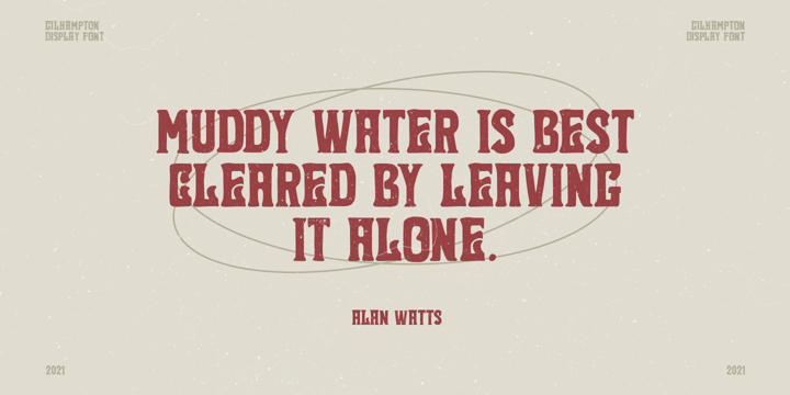
Introducing, Gilhampton organic typeface!
Gilhampton is an organic display font that have an organic and quirky characteristic that makes this font looks natural and hand drawn. this font is perfect for people who are looking for design with organic touch. this font is suitable for branding, packaging, headline, quotes, etc.
 |
| Download Gilhampton Fonts Family From Rillatype |
 |
Hamidha is suitable use for market design developed at this time, this font has a model Trendy, natural and gentle, with this font you can take advantage of the opportunity in every moment of one wonderful way to highlight the celebration of the feast of your best, because this font will be advocates for purposes such as wedding invitations, party, graduation, birthday, gathering, etc.
you need a program that supports Adobe Illustrator CS, Adobe Indesign & CorelDraw X6-X7, Microsoft Word 2010 or a later version.
How to access all alternative characters using Adobe Illustrator:
https://www.youtube.com/watch?v=XzwjMkbB-wQ
Hamidha is coded with PUA Unicode, which allows full access to all additional characters without having to design any special software. Mac users can use Font Book, and Windows users can use Character Map to view and copy any additional characters for pasting into your favorite text editor / application.
How to access all alternative characters, using the Windows Character Map with Photoshop:
https://www.youtube.com/watch?v=Go9vacoYmBw
 |
| Download Hamidha Script Fonts Family From Gatype |


Yes, finally. This one took the most time and the most restarting. Years went into imagining what Lust Text should look like and how it should structurally behave in order to truly improve upon a setting that includes any of the Lust typefaces. I approached it as much from the side of the type designer, as I did a potential user. The flow, the warmth, the personality needed to be there, but all of the excess had to be removed responsibly. In the process, and in need of inspiration, I looked backward to historical artifacts and precedent. In each early Lust Text approach, the solution was lackluster and/or vanilla and not actually a ‘Lust’ typeface. The exercise was not in vain though. By exploring past examples, I found my footing drawing for media now and how it might be used later—all the while, producing seamless, elegant curves and restrained indulgence (that sounds almost silly to say, but I like it).
The Lust Collection is the culmination of 5 years of exploration and development, and I am very excited to share it with everyone. When the original Lust was first conceived in 2010 and released a year and half later, I had planned for a Script and a Sans to accompany it. The Script was released about a year later, but I paused the Sans. The primary reason was the amount of feedback and requests I was receiving for alternate versions, expansions, and ‘hey, have you considered making?’ and so on. I listen to my customers and what they are needing… and besides, I was stalling with the Sans. Like Optima and other earlier high-contrast sans, they are difficult to deliver responsibly without suffering from ill-conceived excess or timidity. The new Lust Collection aggregates all of that past customer feedback and distills it into 6 separate families, each adhering to the original Lust precept of exercises in indulgence and each based in large part on the original 2010 exemplars produced for Lust. I just hate that it took so long to deliver, but better right, than rushed, I imagine.
 |
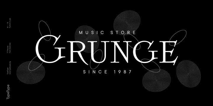
The TT Ricordi font family is a collection of three display heading serifs designed to significantly diversify the traditional font palette. Each font from the TT Ricordi family was drawn by a separate designer and has its own story. With that, all three fonts are close in thickness and similar in their character compositions and are featured in the uppercase set and the small capitals set, which replaces lowercase characters. The fonts have the broad support of Latin languages and support basic Cyrillic.
The project originates from the pre-coronavirus tourist trips to Italy, during which our art director Yulia Gonina has accumulated many photographs of historical inscriptions and tablets. Many of these inscriptions had interesting character or unusual character shapes. We wanted to work with them, to try to reinterpret them, and, if possible, make them ultramodern and accessible to the modern font user.
The fonts from the TT Ricordi typeface turned out to be quite display and contemporary, but at the same time, they retained subtle references to historic inscriptions. The fonts fit perfectly both on the covers of book classics and in glossy magazine layouts. They can also be used in posters and packaging, or as the main expressive element of company branding. In addition, all three serifs from the TT Ricordi font family go well with functional sans-serifs such as TT Norms Pro or TT Commons.
TT Ricordi Nobili is a display serif with a rich Roman ancestry and contemporary world views. It stands out from the crowd with its subtlety and elegance. The font was drawn by Anna Tikhonova and was inspired by an inscription carved into the stone floor of a cathedral in Florence. Because people walked over the inscription, some of the letters got thinner and worn out over time. It is this feeling of disappearing or flickering elements that we wanted to capture and implement in the project.
The TT Ricordi Nobili has high contrast, even though the font itself is quite thin. The serifs in the font are not massive at all, but at the same time, they are display serifs. There is a certain tension in TT Ricordi Nobili, and the viewer perceives this tension. We can say that behind the external classic facade lies a rather modern plot. The font has a large set of discrete ligatures which allow to create interesting combinations and expand the capabilities of the font. There are 709 glyphs in the TT Ricordi Nobili font, and a whole set of useful features, such as: aalt, ccmp, locl, numr, ordn, tnum, pnum, case, dlig, ss01, ss02, ss06, ss07, ss08, ss09, ss10, calt.
TT Ricordi Todi is a wide serif with a classic base and a contemporary nature. The font turned out to be refined yet sharp, and in places even pushy and aggressive. The font was drawn by Yulia Gonina, and the project was based on plaques with engraved street names from the small Italian town of Todi. The main challenge was to decipher the characteristic features of the signs and emphasize them in a modern way. In addition, it was necessary to draw a Cyrillic alphabet that would not be inferior to the Latin alphabet in its expressiveness.
The TT Ricordi Todi has fairly wide character proportions, and there is practically no contrast in them. The main feature of the font is the combination of smooth round shapes with deliberately squared shapes. In addition, the font is characterized by crisp and sharp character details, exaggerated ascenders and descenders, and muted contrast. Among the interesting font peculiarities, you can choose between the characteristic long descenders and ascenders and their more tempered versions, you can find a stylistic set with triangular dots, alternative versions of the EF characters and two letter Ф shapes, round and squared. There are 876 glyphs in the TT Ricordi Todi font, and a whole set of useful features, such as: aalt, ccmp, locl, numr, ordn, tnum, pnum, case, dlig, salt, ss01, ss02, ss03, ss04, ss05, ss06, ss07, ss08, ss09, ss10, calt.
TT Ricordi Fulmini is a fashionable contemporary serif firmly holding on to its historic roots. The font turned out to be like a thistle flower: bright and catchy, but still subtle and delicate. TT Ricordi Fulmini was drawn by Marina Khodak, and the initial inspiration for the project was the inscription on the altar from the National Gallery of Umbria in Perugia. As the font was pulled into “contemporaneity”, it was completely transformed and revealed its new side.
The main catchy detail in the TT Ricordi Fulmini is the aggressive and rather sharp diagonal serifs. In addition, in the process of working on the font, several graphic solutions emerged, for example, the mono-serifs and the very calligraphic connections of diagonal strokes with their historic spirit. We wanted to keep them, and thus 4 thematic stylistic sets appeared in the font, thanks to which we can greatly change the perception of TT Ricordi Fulmini. In addition, the font has a set of interesting discrete ligatures. There are 793 glyphs in the TT Ricordi Fulmini font, and a whole set of useful features, such as: aalt, ccmp, locl, numr, ordn, tnum, pnum, case, dlig, ss01, ss02, ss03, ss04, ss05, ss06, ss07, ss08, ss09, ss10, calt.
TT Ricordi supports more than 180+ languages, such as: Acehnese, Afar, Albanian+, Aleut (lat), Alsatian, Aragonese, Arumanian+, Asu, Aymara, Azerbaijani +, Banjar, Basque +, Belarusian (lat), Bemba, Bena, Betawi, Bislama+, Boholano+, Chamorro+, Chichewa, Chiga, Colognian+, Cornish, Corsican +, Cree, Croatian, Czech+, Danish, Dutch+, Embu, English+, Esperanto, Estonian+, Faroese+, Fijian, Filipino+, Finnish, French, Frisian, Friulian+, Gaelic, Gagauz (lat), Galician+, Ganda, German+, Gusii, Haitianm, Creole, Hawaiian, Hiri Motu, Hungarian+, Icelandic+, Ilocano, Indonesian+, Innu-aimun, Interlingua, Irish, Italian+, Javanese, Jola-Fonyi, Judaeo-Spanish, Kabuverdianu, Kalenjin, Karachay-Balkar (lat), Karaim (lat), Karakalpak (lat), Karelian, Kashubian, Kazakh (lat), Khasi, Kinyarwanda, Kirundi, Kongo, Kurdish (lat), Ladin, Latvian, Leonese, Lithuanian, Livvi-Karelian, Luba-Kasai, Ludic, Luganda+, Luo, Luxembourgish+, Luyia, Machame, Makhuwa-Meetto, Makonde, Malagasy, Malay+, Maltese, Manx, Maori, Marshallese, Mauritian Creole, Minangkabau+, Moldavian (lat), Montenegrin (lat), Morisyen, Nahuatl, Nauruan, Ndebele, Nias, Norwegian, Nyankole, Occitan, Oromo, Palauan, Polish+, Portuguese+, Quechua+, Rheto-Romance, Rohingya, Romanian +, Romansh+, Rombo, Rundi, Rwa, Salar, Samburu, Samoan, Sango, Sangu, Sasak, Scots, Sena, Serbian (lat)+, Seychellois Creole, Shambala, Shona, Silesian, Slovak+, Slovenian+, Soga, Somali, Sorbian, Sotho+, Spanish+, Sundanese, Swahili, Swazi, Swedish+, Swiss German +, Tagalog+, Tahitian, Taita, Talysh (lat), Tatar+, Teso, Tetum, Tok Pisin, Tongan+, Tsakhur (Azerbaijan), Tsonga, Tswana +, Turkish+, Turkmen (lat), Uyghur, Valencian+, Vastese, Vepsian, Volapük, Võro, Vunjo, Walloon, Welsh+, Wolof, Xhosa, Zaza, Zulu+, Belarusian (cyr), Bosnian (cyr), Bulgarian (cyr), Erzya, Karachay-Balkar (cyr), Khvarshi, Kumyk, Macedonian+, Montenegrin (cyr), Mordvin-moksha, Nogai, Russian+, Rusyn, Serbian (cyr)+, Ukrainian.
 |
| Download TT Ricordi Fonts Family From TypeType |
 |
Dissidia is a font that was inspired by the SCARLXRD album poster. The font conveys futurism and horror. His unusual style combines many forms and characters, which makes him unique. The font contains alternative characters that are in lowercase characters.
The font is perfect for posters, headlines, covers, prints, and more.
If you find an error in the font or kerning, or just want to write suggestions, then write to the mail: bunineugene@gmail.com
 |
I made this font during the rather hectic start of 2021. Popular Vote is an easygoing, laid-back kinda font. It fits just about anywhere, regardless of your political orientation, your sense of aesthetics or the job you will use it for.
Popular Vote will feel at home on a box of crackers, on the cover of a book about keto diets, or on that T-shirt you have always wanted to design.
Enjoy!


Enchantee feels equally charming and elegant. This stunning script font is a stylish homage to classic calligraphy. It features a varying baseline, smooth lines, gorgeous glyphs and stunning alternates. This font is PUA encoded which means you can access all of the hearty glyphs and swashes with ease It also features a wealth of special features including alternate glyphs and ligatures.
 |
Milonga This is a beautiful and elegant hand drawn font, will emphasize your individuality in any project. Its relaxed feel makes this font incredibly versatile, fitting a wide range of designs. You can also use them to create a logo or templates, invitations, blog, branding, marketing, book covers, magazines, advertising, stationery, logo design and much more. This font is easy to use has OpenType features
 |
| Download Milonga Fonts Family From Larin Type Co |
 |
I design this Sketch font from my own handwriting. I was inspired by Sketch Writing when I designed buildings.
Fond This can be used in writing books. titles of books, magazines, clothes and can also be used as branding.
 |
Brans family consists of 18 styles (9 weights, 9 Italics), in each of which there are more than 543+ glyphs. In the typeface, each weight includes extended language support, fractions, tabular figures, ligatures, arrows and more. Perfectly suited for graphic design and any display use.
Support for 28 languages:
Afrikaans Albanian Catalan Croatian Czech Danish Dutch English Estonian Finnish French German Hungarian Icelandic Italian Latvian Lithuanian Maltese Norwegian Polish Portugese Romanian Slovak Slovenian Spanisch Swedish Turkish Zulu
 |
| Download Brans Fonts Family From Ckhans Fonts |


Clarins This is a beautiful font duo that includes a Serif and a Script font.
These fonts are written by hand and perfectly match each other, serif leaves streaks from an uneven stroke and looks a little careless and attracts attention, It will fit perfectly into a project where this inaccuracy is necessary. The script written with a brush is perfect for any project and will decorate it, as well as it includes alternates for lowercase.
Enjoy using!


In English folklore (in particular that of Yorkshire and Lancashire), Grindylow is a creature that dwells in rivers and lakes and is said to grab children who come too close to the water’s edge and drown them. It is thought the name Grindylow may be connected to the monster Grendel.
Grindylow font does not grab children; it is a rather messy handmade brush font. I used a cheap brush and Chinese ink to create the glyphs.
Comes with discretionary double letter ligatures for the lower case.
 |
Comilfo is an amazing handwritten font that is delicate and elegant. It will emphasize your personality in any project and will charm you with its signature. Comilfo looks stunning on wedding invitations, thank you cards, quotes, greeting cards, logos, business cards and every other design which needs a handwritten touch. This font includes alternates, ligatures, and swashes. Comilfo has OpenType features.
 |
Quartiel is a casual handwritten brush font. Written by hand using a dry brush pen. With fast movements. But, keeping the height of each letter the same. Comes in two styles, regular and slanted also include swash as a sweetener.
Suitable for all creative projects, especially in headlines, branding, advertising, packaging, and more. And will give a natural, and authentic touch to each of your projects.
 |
| Download Quartiel Fonts Family From Trustha |


Quadrim - Serif Font Family - Multilingual -12 Style (2020)
On the basis of Quadrim, it is a mix of the old-fashioned Roman serif family. The old style serif combination combines, modern aesthetics with fantasy and Art Nouveau serif fonts, making Quadrim a versatile family that can be used in many different design projects.
This font offers a wide variety of styles to help you discover the best mood for your projects, from body text to large titles, from classic styles to modern and bold styles.
It is very suitable for book and magazines, magazine covers, editorial, titles, websites, logos, invitations, branding, advertising and more.
CHARACTER RANGES :
Basic Latin,
Latin-1 Supplement,
Latin Extended-A,
Latin Extended-B,
General Punctuation,
Currency Symbols,
CJK Symbols And Punctuation,
Private Use Area (plane 0),
With this font you can create your unique designs.
If you have a question, please contact me.
Have a good time.
 |
My family and I recently moved to a ‘fixer upper’ farm from the 1930’s. It came with a slightly run down barn, 4000 square metres of land and a LOT of redcurrant bushes. I can’t really say that I am overly fond of them. I find them a bit too tart. As a kid, I used to smother them in sugar, but I can’t do that any longer, since I am a responsible dad… ;-)
Redcurrant is a slightly wonky, slightly crazy handmade font. It can be used for book covers or post cards, but feel free to use it for whatever.
Comes with cute little swashes as well.
 |
Pain de Mie is a soft font, friendly and sweet, kinda creamy, kinda bubbly.
It's an all caps font with 2 different glyphs for each letter: easily access these through the keyboard upper or lower cases keys. Make them cycle with OpenType Contextual Alternates. There's also a handful of drawings to add an extra charm here and there. Reach these via OpenType Ornaments or pick your choices through a glyphs palette.
Like a fresh loaf of bread, Pain de Mie goes well in so many ways. Give it a try!
 |
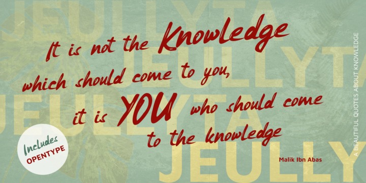
The name Jeullyta is taken from the Indonesian language but with modified pronunciation. The correct one is Jelita which means "Gorgeous".
I named this font Jeullyta because it is gorgeous, from the initial process until the end product. It is a strong yet nice looking script font and can be considered a brush font too with the shadow on the body of each glyph.
This font is suitable to be used for:
It comes with hundreds of stylistic alternate glyphs to enhance the feel of your design. Enjoy!!
 |
| Download Jeullyta Fonts Family From Tigade Std |